Johnson’s Popcorn
Re-brand
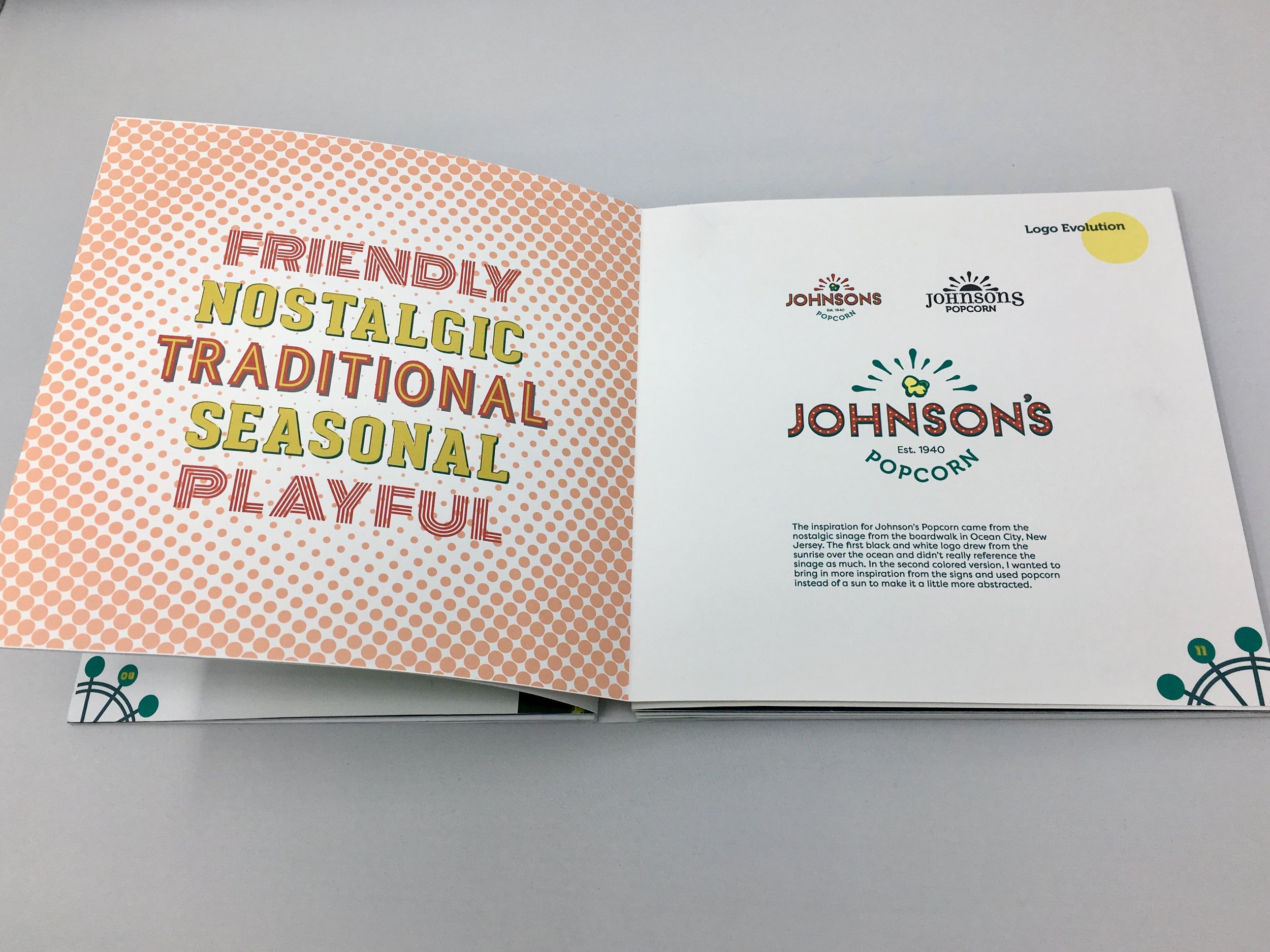
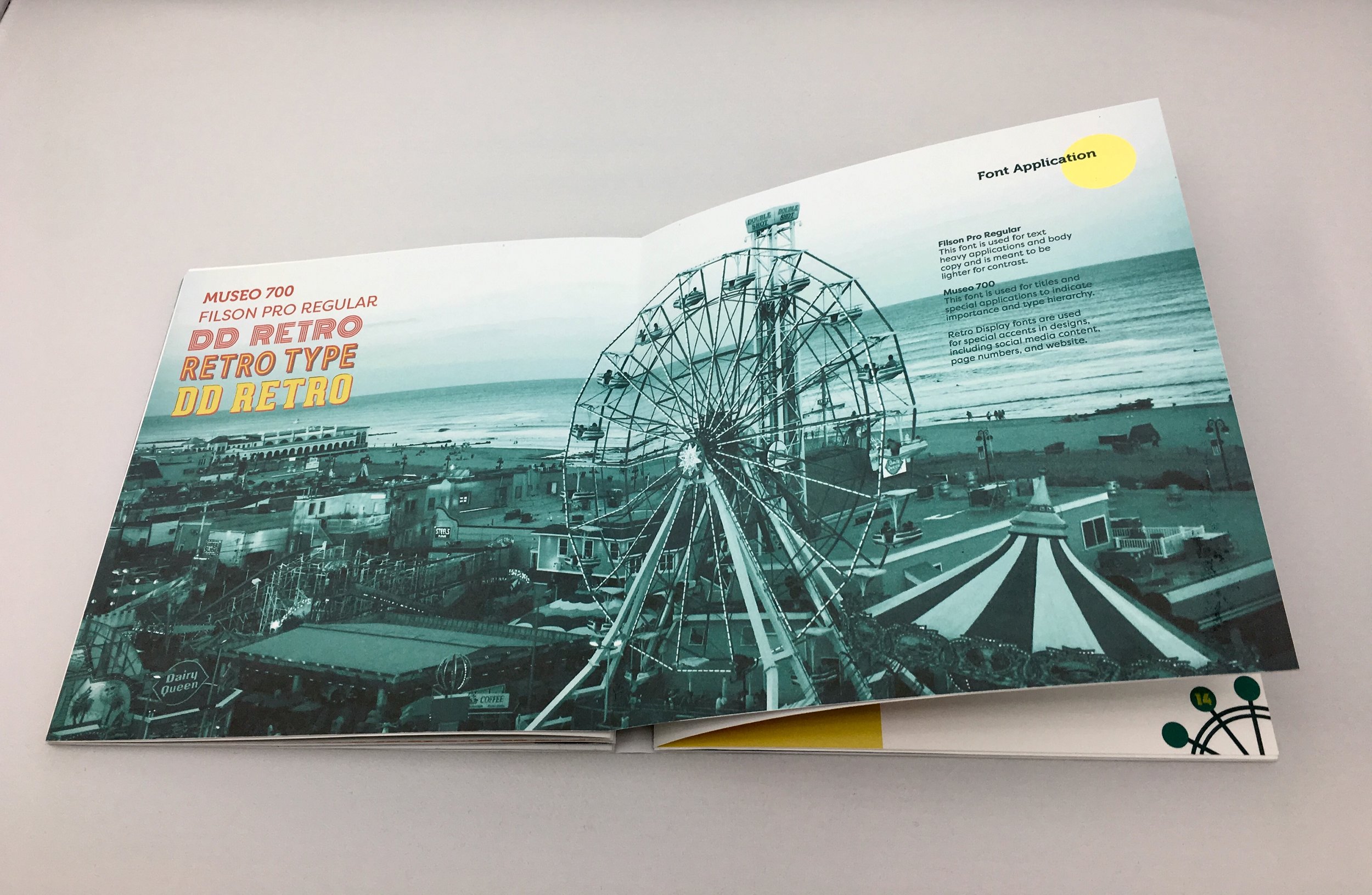
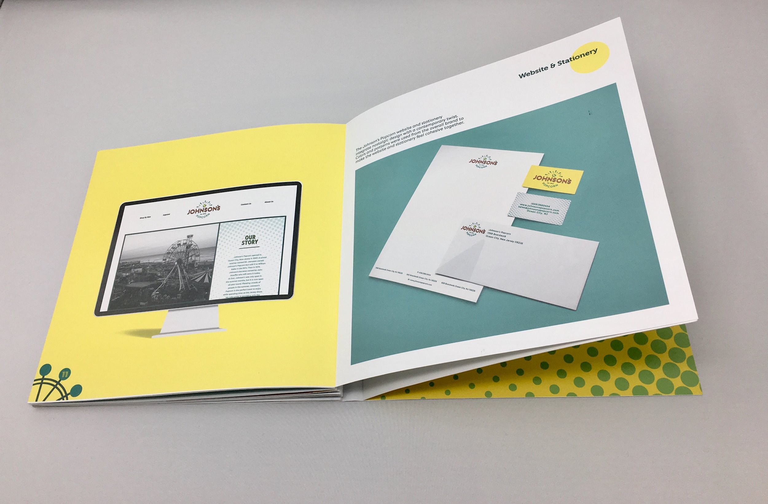
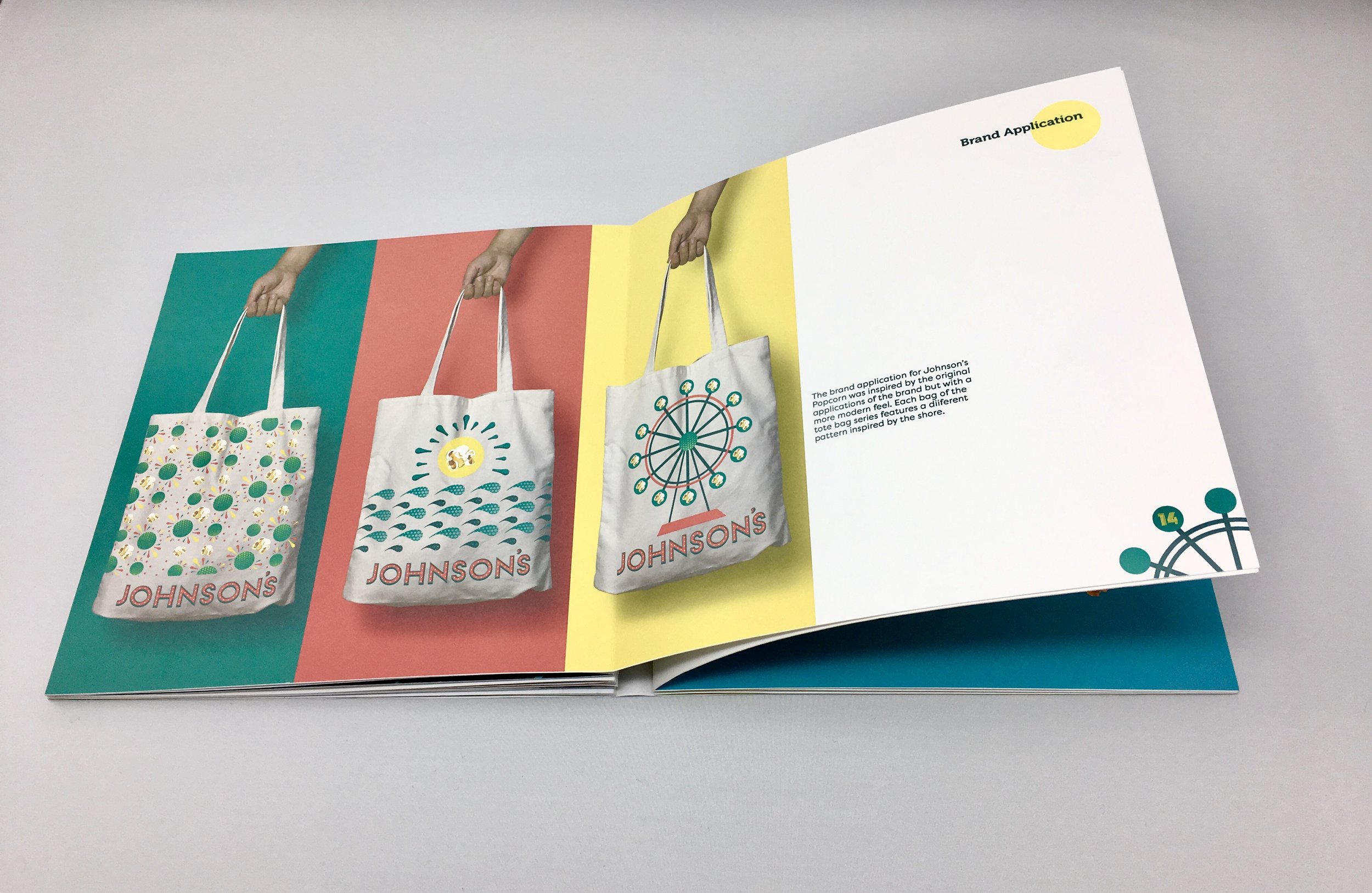
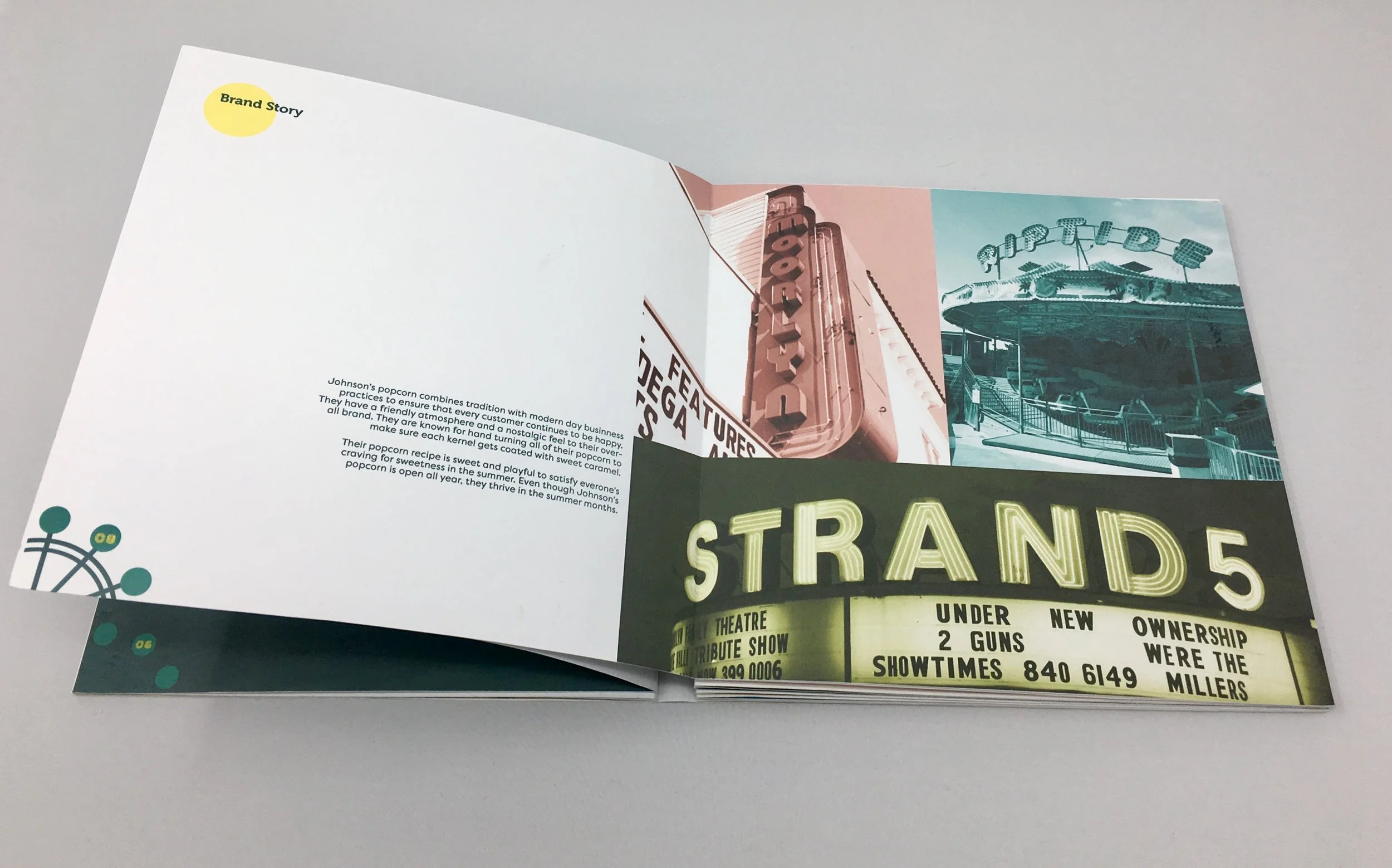
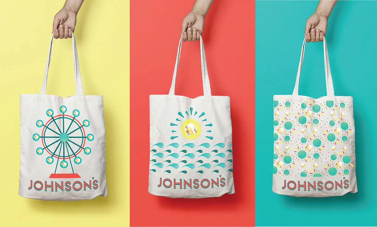
Inspired by the traditions and vintage style of the Jersey shore, the re-brand of Johnson’s Popcorn showcases design styles of the shore. The overall color palette symbolizes a new take on an old brand, while referencing vintage colors found on the boardwalk. The font choices are inspired by boardwalk and ride pier signage that give the brand a newer feel while still feeling retro.

Logo Iteration


Collateral


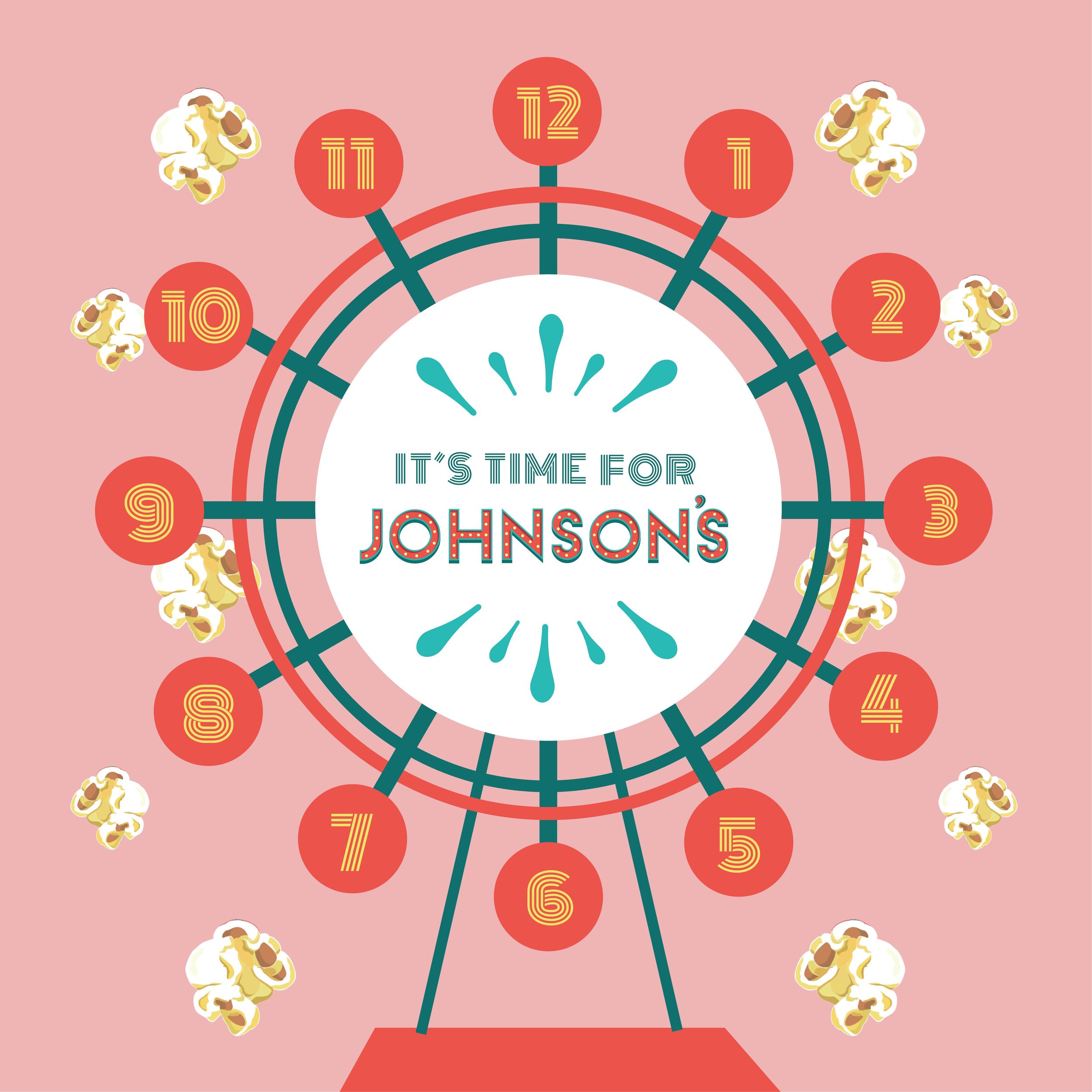
Social Media Illustrations

Brand Manual